The Psychology of Typography
The Psychology of Typography
The typography used on your website, logo, letters and any other written/typed wording gives your customer their first impression of your business so it is very important you choose the right typography as you don’t want to give the wrong impression.
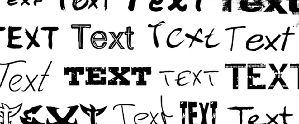
Fonts are split into 4 main categories:
Serif- This is a typeface with little lines added onto the end of each character called serifs. For example, Times New Roman and Palatino.
Sans Serif – This typeface has no little lines added onto the end of the characters, so is quite simple and curved. Two popular types of this font are Arial and Helvetica.
Slab – This font type is characterised by its use of bold serifs. For example, Sentinel or Foro.
Script – Characterised by its appearance, this font is in the style of elegant handwriting. Popular examples include Coronet and Gravura.
How do these fonts communicate?
Different fonts communicate a different message to each person reading it so make sure to carefully choose your font and do research to see whether it will give the desired effect.
Serif fonts are simple and traditional and communicate to people reading it that your business is professional. A famous example of this font in use is the ‘Google’ logo. With this font choice, Google is putting across to its users that it is serious, professional and simple to use.
Sans Serif fonts communicate that your business is modern and progressive. Helvetica is one of the most commonly used fonts for modern business and this is understandable as it is clean and captures the attention of the customers. Some famous logos that use Sans Serif fonts are Kawasaki and Panasonic. Here at The Printing House we use Helvetica as our font, keep reading to find out why.
Slab fonts are the least popular fonts but are bold, traditional and give a very professional feel. They are often used for book titles/text and blog posts. It’s a great font for well established companies including those in the finance, bank and literature industries.
The elegant handwriting style of the script fonts gives a luxurious impression. It shows the customers that you are exclusive and traditional, but also professional. Brands including Coca-Cola used this font style.
Size and Spacing
Think carefully about the size and spacing used for your logo/body text. This will also help to convey your message to your customers, so you want to be saying the right thing!
Oversized lettering can grab the attention of people and get your message across quickly. But it can be considered childish and inappropriate for serious matters/businesses. It is best used for news blasts, sales promotions and fun businesses wanting to attract younger people.
Small font is more gentle and professional. For example, a piece of text written in a small font with lots of space around it will work the same way as a whisper. The audience will be drawn to reading it.
When choosing your font and spacing consider readability, your audience and how you want the message to be read. If your font is close together it causes the reader to read quickly making it seem faster and urgent. Whereas if the font is spaced out the reader takes their time and it seems calmer.
Think about your customer
You need to choose the font/design that is most effective but is also best for your customer. Think about what they are most likely to respond to, for example if your target audience is aged 18-24 they are more likely to respond to a sans serif font rather than a script font. If your customers are high earning individuals choose a script style font to show that you are an established luxury brand.
Why we chose to use Helvetica
The font we use here at The Printing House is Helvetica. We chose this font during our 2017 re-brand as it is modern and represents the fact we are a forward thinking and progressive business. We feel it helps to make our website look clean and grabs the attention of our customers. Helvetica is used in both our logo and main body text to bring everything together, we even embroider our staff uniform in this font!
Below is a handy infographic to simplify which fonts create which emotions with the reader – this should help you choose the perfect font for your logo, website and print.
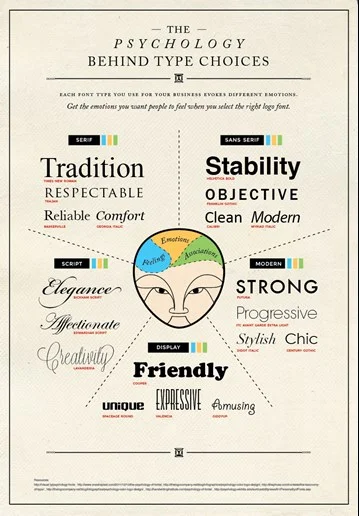
Source for Infographic
https://www.crazyegg.com/blog/psychology-of-fonts-infographic/
Here at The Printing House, we think the font you choose is essential to making your print look perfect. If you are unsure about which font to choose or which font matches your images then speak to a member of our graphic design team via email – enquiries@theprintinghouseltd.co.uk or call us on 01270 212100.