Autumnal Colour Palette
Autumnal Colour Palette
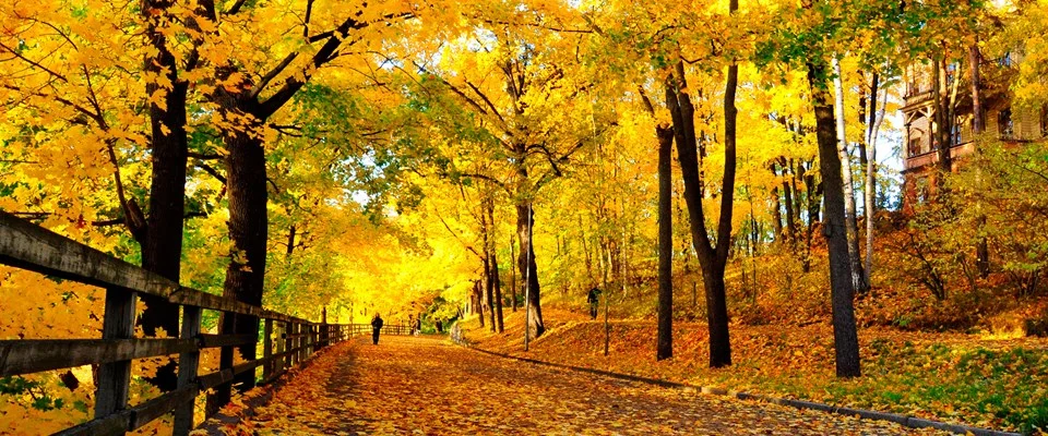
As summer fades away (was it ever here?) and autumn fast approaches, we want to take a look at the different colours that encompass everything we think of when we think of autumn.
Autumn colours tend to be broken down into 4 categories: True Autumn, Soft Autumn, Deep Dark Blue Autumn and Vibrant Warm Autumn.
True Autumn
These are the colours we automatically think of when someone mentions autumn. The falling leaves, the comfort food and the clothes we wrap ourselves up in. Colours like paprika, tan, chocolate and ochre are the deep, rich and orange toned colours that get us excited for the upcoming colder months leading to Christmas.
Soft Autumn
A cross between summer and autumn, these colours remind us of the warmer months but incorporate the ashy and cooler tones of the autumn and winter months. These are colours such as mocha, mellow rose, taupe and old gold. Not your ‘Traditional’ Autumn colours, but these still make us feel warm and cosy.
Deep, Dark Blue Autumn
The darkest of the autumn colour palettes, with deep warm blue undertones. All the colours seen in this palette are quite similar as they all have blue hues.such as aubergine, marine blue, teal and dark olive.
Vibrant and Warm Autumn
Last, but not least is the colour palette with the most vibrancy and brightness. These colours look like they belong in spring or summer but on closer inspection have golden-brown undertones which mean they fit perfectly with autumn. In this palette expect to see colours such as poppy, moss, blue jade and saffron.
It’s important to understand what colours are popular during each season we are in, especially when producing printed marketing materials and digital marketing campaigns. We need to ‘fit’ into the current season and inspire our customers with what is currently relevant. Take a look below at some of the colours included in an Autumnal Colour Palette.
